
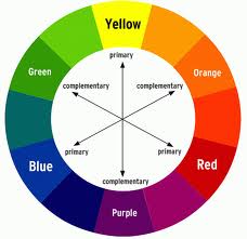
 In colour theory, two colours are called complementary if, when mixed in the proper proportion, they produce a neutral colour (grey, white, or black). In roughly-perceptual colour models, the neutral colours (white, greys, and black) lie along a central axis. For example, in the HSV colour space, complementary colours (as defined in HSV) lie opposite each other on any horizontal cross-section.
Thus, in the CIE 1931 colour space, a colour of a particular “dominant” wavelength can be mixed with a particular amount of the “complementary” wavelength to produce a neutral colour (grey or white). In the RGB colour model (and derived models such as HSV), primary colours and secondary colours are paired in this way: red and cyan; green and magenta; blue and yellow.
One of the simplest way of ensuring that colours contrast is to use a colour wheel. The complimentary or contrasting colour is the one that is directly opposite the one chosen. This is however not always complimentary to the design or effect that is trying to be achieved.
 Where the minimum contrast of 30% is required it is advised to have tests conducted or to utilize the contrast calculators the Luminos Consulting provide. This does require the LRV’s or cd/m2 to calculate the luminance contrast ratios.
The requirements in the built environment for contrasting colours has greatly increased in the past few years. One of the best ways to know whether two colours are sufficient in contrast is the age-old test – “Can you see two colours and does it look right?”