
 The primary aim for signs is to be SEEN!!! – Of what use is a sign that blends into its background or has text the same colour as the background? It’s useless!!! Signage benefits all people from all areas of life and assists us navigating through busy, difficult and unfamiliar environments. It is essential that all signage stands out and is easily understood.
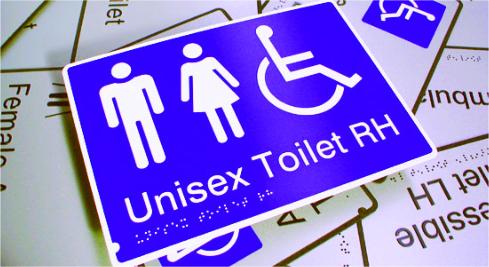
Just take time square in New York as an example – signage experts competing for their signs to stand out. This is also the case with signage for information purposes and identification of certian building elements that relate to disability access requirements.
The Access to Premises Standards states:
The following apply to luminance contrast: (a) the background, negative space, fill of a sign or border with a minimum width of 5 mm must have a luminance contrast with the surface on which it is mounted of not less than 30%;
(b) tactile characters, icons and symbols must have a minimum luminance contrast of 30% to the surface on which the characters are mounted;
(c) luminance contrasts must be met under the lighting conditions in which the sign is to be located.
This therefore means that signage too must meet the minimum 30% luminance contrast ratios and in most cases will require a test to confirm compliance.