Shedding Light on Luminance Contrast

  • November 29, 2013
  • Bruce Bromley

Here at Equal Access we’ve had a run of enquiries lately about Luminance Contrast.

The Building Code of Australia (the ‘BCA’) and the Disability (Access to Premises – Buildings) Standards 2010 (the ‘Premises Standards’) have minimum ‘deemed to satisfy’ provisions for levels of luminance contrast provided to parts of a building and on accessible path of travels.

Contrasting Nosing Strips on a Stairway

To provide some guidance we have a detailed page on our website, and some time ago also developed a simple downloadable Luminance Contrast Calculator (under the Designers Info section). But I thought I’d put up a quick post to summarise these requirements:

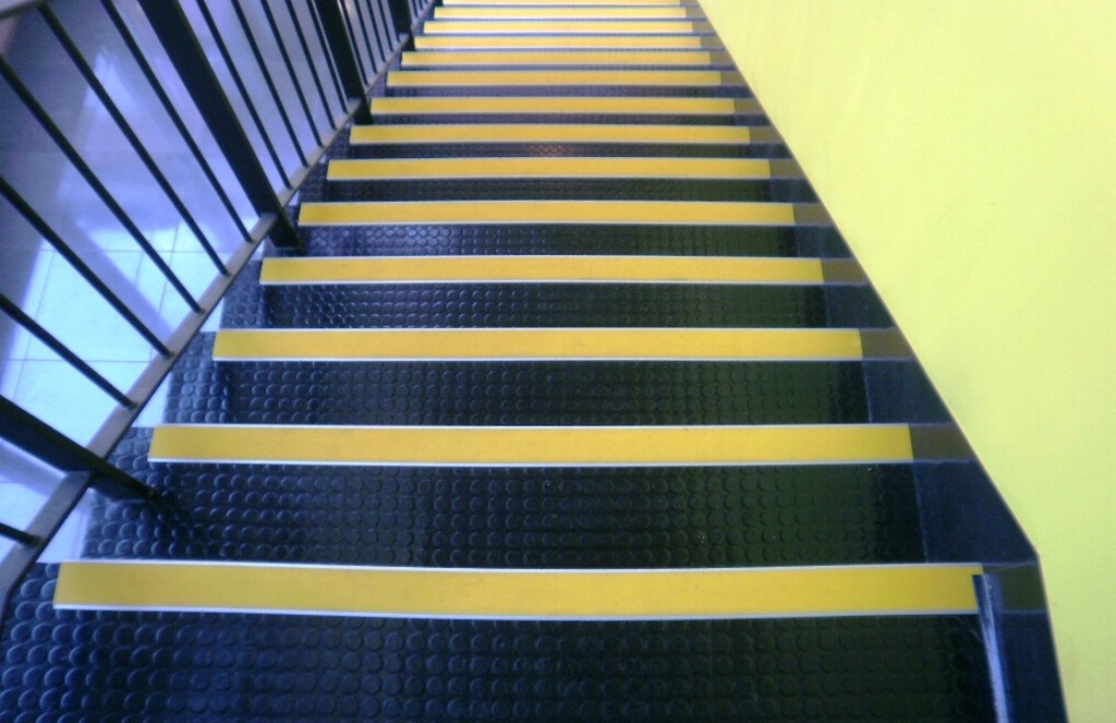
Luminance contrast is defined in Australian Standard 1428.1-2009 as ‘the light reflected from one surface or component, compared to the light reflected from another surface or component’. It is not the difference in the colour or the colour contrast, but the difference in the light reflective properties of each colour.

The minimum luminance contrast requirements in the BCA and Premises Standards include:

  • Tactile ground surface indicators (or TGSIs) – 30% contrast for TGSI tiles, 45% contrast for the single coloured ‘discrete’ TGSI cones and 60% contrast for two colours or materials used for ‘discrete’ TGSI cones.
  • Stairway nosings – Each tread with a strip not less than 50 mm and not more than 75 mm deep across the full width of the path of travel with 30% contrast to the tread background.
  • Accessways – Obstacles that abut an accessway must have 30% contrast to the background.
  • Braille signage – The background, negative space, fill of a sign or border to have 30% contrast to the surface on which it is mounted (i.e. a wall). Additionally, tactile characters, icons and symbols must have 30% contrast to the surface on which the characters are mounted (i.e the sign).
  • Lift control buttons need a coloured border on or around the button at least 3 mm wide around the button, or the button needs 30% contrast to the background.
  • Glazing – 75mm wide band with 30% contrast when viewed against the floor surface or surfaces within 2 m of the glazing on the opposite side, see our recent blog post on Glazing Bands for further information.
  • Doorways – 30% contrast around the doorway, with a minimum width of 50mm for the contrast area, which allows for a contrast between the door and the frame, frame/door to wall, or the door to wall etc.
  • Accessible toilet seats – 30% contrast to the background ‘against which it is viewed’, which could be the wall, floor or the toilet pan – and no you don’t need a blue seat it can be any colour as long as it achieves the 30% contrast. I believe that the intent of this is so that someone standing in the doorway can identify the toilet pan, that’s where I would take my ‘view’ from.

Hope that helps to ‘shed some light’ on luminance contrast requirements, if you have any questions please contact me.